Wall shelves styled in groupings of two to four objects across measured sections take an afternoon and no special skill, but most displays fail because people pack every inch instead of leaving thirty percent of each shelf empty.
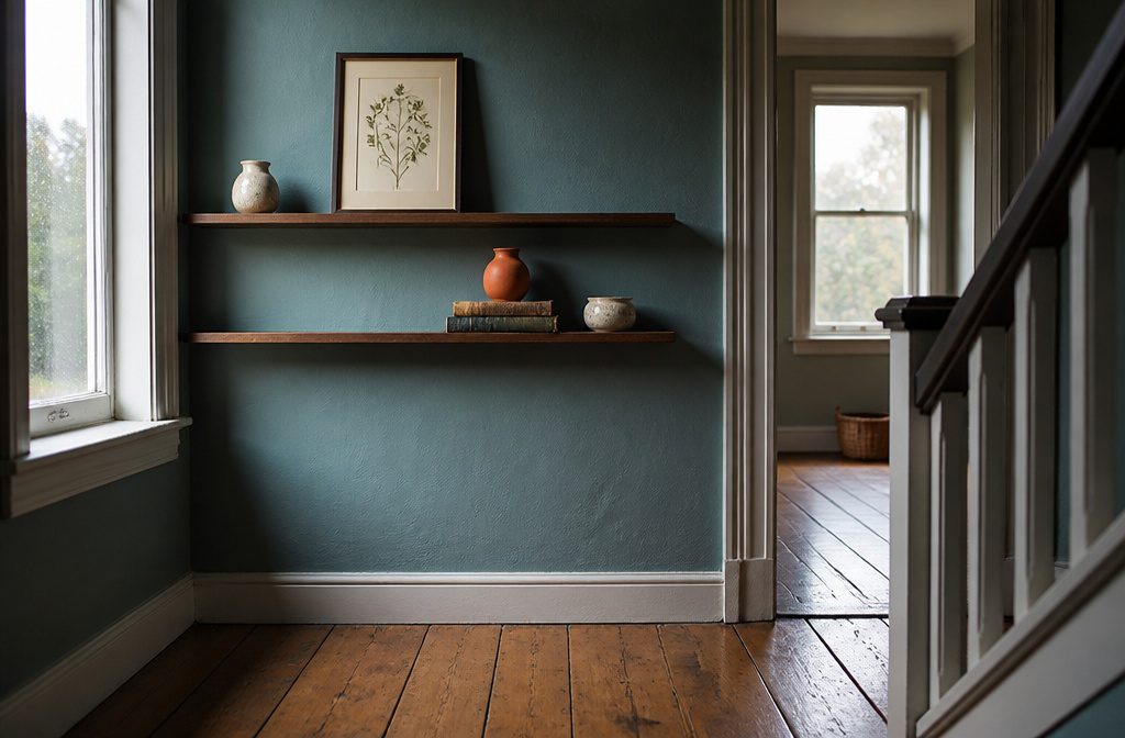
The article breaks styling into anchors first—framed prints leaning against the back wall, stacked books as risers—then layering smaller objects diagonally across shelves rather than in straight lines.
1. Plan for the Space and the Look
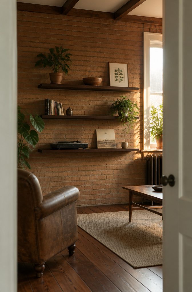
Start by looking at where the shelves sit and what the room does.
Shelves in a living room hold personality and maybe a record player; office shelves want books tied to the work and art that keeps you going; bathroom shelves need containers and the things you reach for when the day winds down.
The room’s function decides what belongs there before style enters the picture.
Then note what the wall itself lets you do.
Floating shelves look sharp on brick or tile, but the install takes planning. If the wall cooperates, think through the shelf material and the style you want.
I pull inspiration images and watch for what stops me: the color, the way objects cluster, the amount of breathing room. That pattern tells me what I’m after before I start arranging anything.
2. Measure the Shelves and Decide How Many Groupings
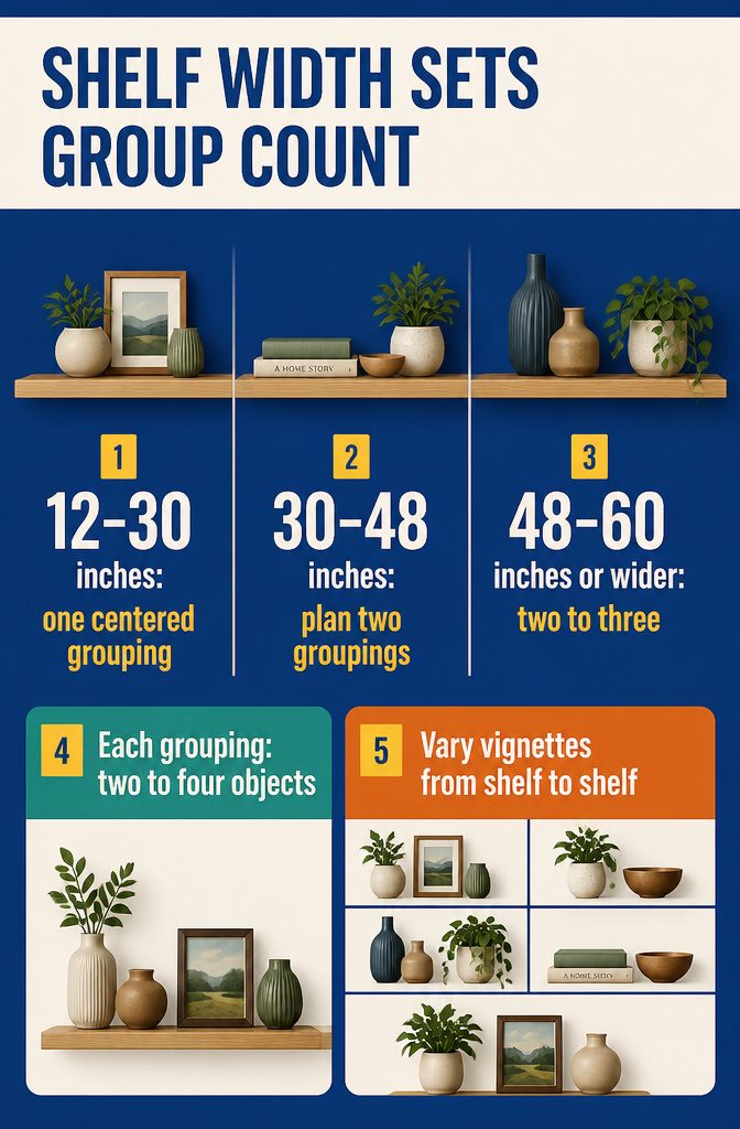
- Measure the width of each shelf. Shelves about 12–30 inches wide hold one grouping centered in the middle. For shelves approximately 30–48 inches, plan for two groupings. If your shelves run 48–60 inches or wider, use two to three groupings.
- Think of a grouping as about two to four objects placed close together. They might share a size, color, or shape, or they might just look right side by side.
- Treat each shelf as a series of separate vignettes rather than one long space to fill. Switch between one larger centered arrangement, two smaller groupings, or an asymmetrical layout from shelf to shelf. That variety keeps your eye moving instead of marching straight across.
3. Clear the Space and Gather What You Own
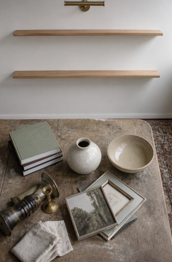
Start with empty shelves. Pull everything off so you can see the full depth and the vertical space you’re working with, and check whether the back wall needs attention.
Touch up paint or patch any drywall holes now, because once the shelves are loaded and styled, reaching behind a stack of books or a framed photo to fix a scuff becomes awkward work you’ll put off.
While the shelves are bare, look at the lighting. Does the spot get enough natural light during the day, or will you need a small lamp or picture light to keep the display from disappearing into shadow after dark?
Note the wall color too. A dark wall can make lighter objects pop, but it also swallows detail if the room stays dim.
Now gather what you already own. Walk through the house and collect books, small framed photos, vases, bowls, candlesticks, anything with a shape or finish that pulls you in.
Lay it all out on a table or the floor. You’re not committing to any of it yet, just seeing what’s available before you spend money on new pieces.
4. Place Large Anchors or Leaners First
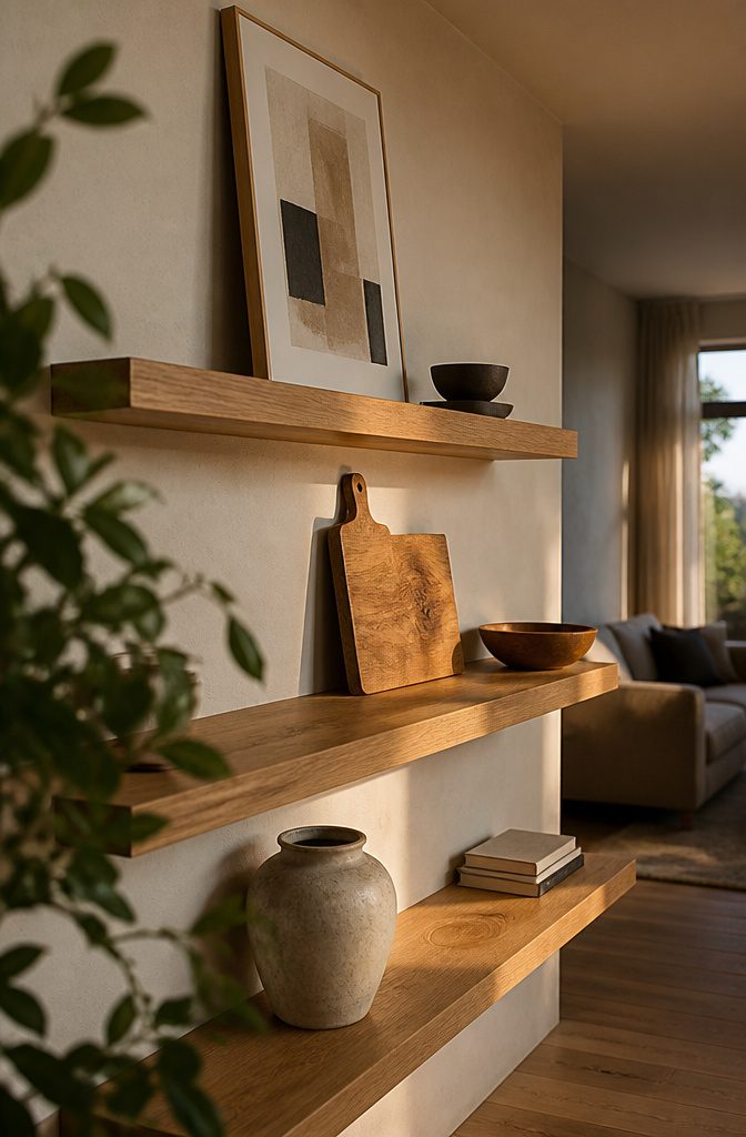
Large anchors are what keep a grouping from looking like you just scattered things at random.
I start with the biggest piece in each cluster: a framed print leaning against the back wall, a mirror, or something solid like a wide wood bowl or coffee table book turned face-out.
These "leaners" fill the back layer and give height, which grounds everything you stack or tuck in front.
The frame or mirror doesn’t have to sit dead center on the shelf. Space your focal pieces diagonally across different tiers so they pull the eye across the whole wall rather than bunching in one corner.
A large framed canvas on the top shelf, a wood cutting board midway down, and a ceramic vase on the lowest level spreads the weight and keeps one shelf from hogging all the presence.
5. Build the Display with Books and Varied Heights, Shapes and Textures

Books anchor the display and give structure to everything else. Line up a few books vertically using bookends, then stack others flat horizontally to create elevated platforms for smaller objects.
The horizontal stacks work as natural risers: set a ceramic bowl or small sculpture on top, and the piece lifts off the shelf plane. That layering at different depths keeps the arrangement from reading flat.
After the books go in, add organic shapes. A trailing pothos or faux stems in a bud vase break up the hard horizontal lines that shelving and book spines create.
Next layer in framed art or photos, leaning a few pieces against the wall and overlapping them slightly when the shelf allows it.
Shallow art ledges will not let you stack books the way deeper shelves do, so lean art directly and fill in with smaller decorative objects instead.
Vary the shapes and heights throughout.
Round mirrors, decorative plates and lidded boxes provide contrast to all the linear forms. Grouping pieces in twos and threes rather than spacing them evenly keeps the display from looking too controlled.
6. Add Natural Elements and Personal Pieces

Natural elements give the eye somewhere to rest. Plants, greenery, dried grasses and seed pods all work, and real looks better than faux in most cases.
Place plants diagonally from other plants rather than in a straight line across—same for objects in similar colors or made from the same material.
That diagonal repetition draws the eye around the whole arrangement instead of letting it stay in one spot.
Group smaller items in threes or fives. The human brain processes odd numbers more easily than pairs, so a candle, a textured sphere and a small frame read as a unit where two objects just sit there.
Mix photos, objects you actually like looking at, and things that repeat a color or finish from elsewhere on the shelf.
Trailing pothos spills over the edge and breaks up rigid horizontal lines; small succulents and raw crystal clusters do the same without the watering.
The repetition makes unrelated objects feel connected without forcing a theme. Two or three repeated shapes or colors are enough.
7. Edit and Check Balance and Negative Space

Once the display is built, step back at least ten feet to see whether the arrangement feels balanced or whether one side pulls too much visual weight.
If something looks heavy, move a darker object to the opposite shelf or slide it lower. The two-minute edit separates a display that reads as interesting from one that crowds itself out.
Walk away for a day or two before calling it finished. When you pass by and nothing catches your eye as out of place, the shelf is done.
Until then, shift things around. The rhythm of letting a display sit and then adjusting what nags at you beats trying to lock every piece into position in one session.
Leave at least thirty percent of each shelf empty.
Objects need open space around them so the eye can rest and each piece registers on its own. A shelf packed edge to edge reads as clutter no matter how carefully you chose what sits on it.
Negative space has as much value as the objects themselves, and at least one pocket of relief per shelf lets the shelf itself show through.
Balance, Variety and Visual Weight

Balance, Variety and Visual Weight
Balance is not the same as symmetry. Symmetry puts identical pieces on either side of a center point, and while that can work, it often reads as obvious.
Balance looks at the overall mix of color, size and shape across the shelf without forcing perfect mirroring. The brain picks up on the spread of visual weight, and that tension keeps things interesting.
I keep displays cohesive by varying heights, shapes and sizes rather than stacking similar objects end to end.
If one side feels heavy, I move a darker object to the opposite side or place it lower. Grouping pieces in close proximity helps a shelf feel intentional rather than cluttered and random.
Editing matters.
Removing at least one item per shelf and stepping back to check the balance of weight and color makes the difference between interesting and overcrowded. Leaving space lets the eye rest and keeps the natural material visible.
Leaving Space Between Groupings
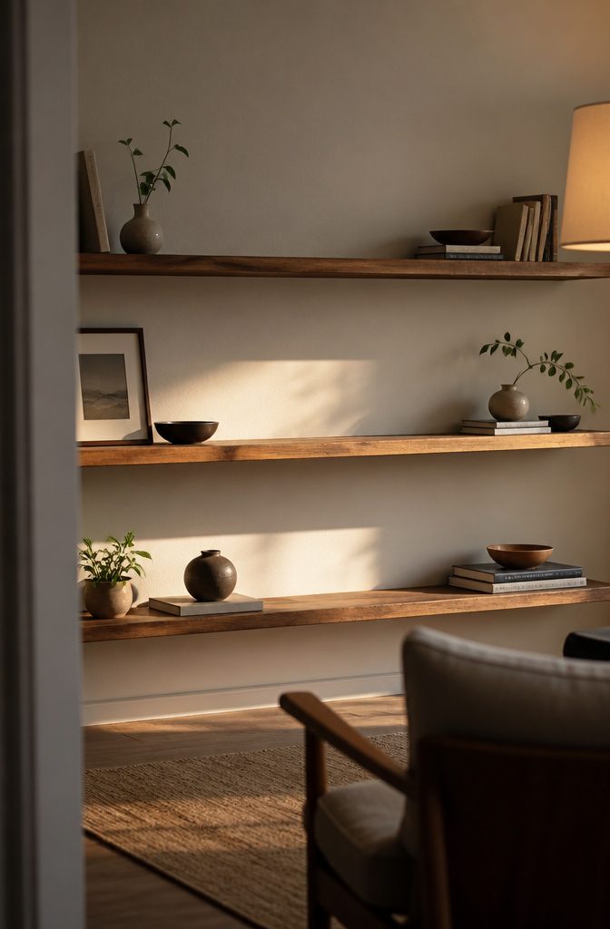
Open space reads as part of the design, not as something left over.
When every surface carries an object, the eye has nowhere to rest and the display becomes a crowded collection rather than a composition the viewer can take in piece by piece.
Leave at least 30% of each shelf empty so the arrangement itself holds shape and the wall behind it stays visible.
That empty portion can sit in a single stretch at one end, or it can arrive as breaks between smaller groupings across the shelf, but it needs to exist somewhere on every level.
Negative space gives the objects room to register individually. A book leaning against a small vase reads clearly when a few inches of open shelf sit to either side; pack more in and both pieces disappear into the mass.
Step back ten feet and check whether one section feels heavier than the rest. If it does, move something or pull an object out entirely rather than filling the gap.
Room-by-Room and Shelf-Type Choices

Different shelf types and rooms call for different balancing acts, but the 60/30/10 ratio holds across all of them: roughly sixty percent functional, thirty percent decorative, ten percent personal.
- Ledges and floating shelves in kitchens work best when most of what sits there gets used. Store everyday plates and bowls within reach, then add a small plant or a vintage canister for visual interest.
- Geometric or honeycomb shelves in living rooms need restraint. One or two objects per compartment keeps the look intentional rather than stuffed.
- Industrial pipe shelves in bathrooms can hold rolled towels, a tray of toiletries, and a single framed print. The metal frame already brings texture, so the styling can stay simple.
- Ladder shelves in bedrooms lean well when the lower rungs carry baskets or folded blankets and the upper rungs display a few books or a small clock.
- Corner shelves in nurseries benefit from soft toys on the lower levels where a toddler can see them, with keepsakes or a night light up top.
- Office shelves behind a desk should keep reference books and supplies at eye level, with one or two personal photos tucked between the stacks.
Seasonal Refreshes

The shelves do not need a tear-down every time the calendar turns.
Keep your anchors in place and swap the lighter layers around them. The heavy objects that hold the composition—the ceramic vase, the framed art leaning at one end, the stack of hardbacks—stay put.
What changes are the flowers, a few book spines pulled forward or rotated out, and a set of photos.
Restyling at least four times a year keeps the display from looking locked in amber without burning a weekend each time.
Spring might mean a pitcher of branches and brighter book jackets where deeper tones sat in winter. Summer could be a single stem in a narrow bottle and a postcard propped where the heavier frame was.
The moves are small enough that the whole shelf does not need to be cleared and rebuilt, which means the job takes minutes rather than an afternoon of second-guessing every grouping again.
Frequently Asked Questions
How to make wall shelves look good?
Start with large anchors like framed art or a wide bowl, then add books both vertically and stacked flat to create height variation.
Layer in plants, varied shapes, and personal pieces while leaving at least 30% of each shelf empty. Step back 10 feet to check balance and edit out anything that crowds the display.
What is the 3-5-7 rule in decorating?
Group smaller items in threes or fives rather than pairs.
The human brain processes odd numbers more easily, so a candle, textured sphere, and small frame read as one unit where two objects just sit there. This principle keeps arrangements from feeling static or forced.
How can I decorate a shelf in a stylish way?
Place your largest piece first to anchor each grouping, then build around it with books, plants, and objects of different heights and textures.
Keep a cohesive look by repeating 2 or 3 colors or materials diagonally across shelves. Leave open space so each piece registers individually instead of disappearing into the mass.
What are some creative ways to decorate shelves?
Lean framed art against the back wall and overlap pieces slightly when depth allows.
Stack books horizontally to create platforms for bowls or small sculptures on top. Add trailing plants like pothos to spill over edges and break up the rigid horizontal lines that shelving creates.
What makes a wall shelf look designed instead of cluttered?
Balance and negative space separate interesting from overcrowded.
Vary heights, shapes, and sizes across the shelf rather than lining up similar objects end to end. Keep at least 30% of each shelf empty and group pieces close together in clusters of 2 to 4 objects so the arrangement reads as intentional.
Which wall shelf decor ideas work best with different shelf types?
Match the arrangement to what the shelf does and how deep it sits.
Floating shelves in kitchens hold everyday items plus a small plant, geometric shelves need just 1 or 2 objects per compartment, and ladder shelves work best with baskets on lower rungs and a few books up top.
Industrial pipe shelves can stay simple since the metal frame already brings texture.
How do you style shelves by room for function and beauty?
Start with what the room needs before style enters the picture.
Office shelves keep reference books at eye level with a photo or two tucked between stacks, bathroom shelves hold toiletries in a tray plus one framed print, and living room shelves can carry personality with a record player and art.
The 60/30/10 ratio holds across all rooms: 60% functional, 30% decorative, 10% personal.
How do you avoid the most common shelf styling mistakes?
Leave open space instead of filling every inch, vary heights so nothing reads flat, and place large anchors first to ground the display.
Use books and horizontal stacks to create platforms at different depths. Step back 10 feet and remove at least one item per shelf if the arrangement feels heavy or crowded.
Can a simple formula make seasonal refreshes easy?
Keep your heavy anchors in place and swap the lighter layers around them.
The framed art, ceramic vase, and stack of hardbacks stay put while you rotate flowers, book spines, and photos. Restyling 4 times a year keeps the display from looking locked without rebuilding the whole shelf each time.