

I’ve spent years staring at fabric swatches until my eyes crossed. Blue walls, whether that barely-there sky in your guest room or the moody navy you painted your bedroom, are actually the easiest backdrop to dress because they play nice with almost everything. The trick is matching your curtain choice to the specific depth of your blue rather than grabbing whatever “coordinates” and hoping for the best.
For light blues, I reach for crisp white, soft gray, or whispery taupe. Sheer white panels filtering sunlight into golden haze deliver exactly what you want.
Medium blues crave beige and warm gray with linen textures, while dark blues demand navy, charcoal, or deep green for that cocoon-like drama.
Feeling bold. Mustard, gold, and blush add personality without screaming, and brass hardware ties it all together. I learned the hard way that patterned curtains need large-scale motifs on dark walls, solids let everything breathe, and those free swatches work as lifesavers for catching how afternoon sun completely transforms everything. Test them at different times, step back, and watch them dance. Your walls will look better when you invest this attention, and testing different options will show you which combinations work best for your space.
Choosing Curtains for Blue Walls: Start With Your Shade
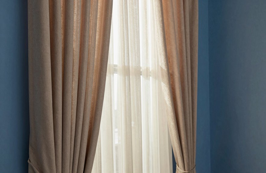
When I’m standing in front of a wall that’s basically the color of a perfect summer sky, or maybe more like the bottom of a really deep swimming pool, I know I’ve got to match my curtains to that specific blue, not just “blue” in general.
Your curtain colors depend entirely on which shade of blue you’ve got going. Light-blue walls call for something with contrast, maybe a shade darker so the room doesn’t float away. Navy blue walls work well with complementary tones that pop. Think warm, think bold, think drama.
Patterned curtains work when you’re feeling indecisive. A print that pulls in complementary tones, such as soft yellows and warm olives, adds personality without being overwhelming. Always test swatches first, because that “perfect” beige can look strange under certain lighting conditions. Your eyes are the best judge, not the store display.
Light Blue Walls: White, Gray, and Soft Neutral Curtains
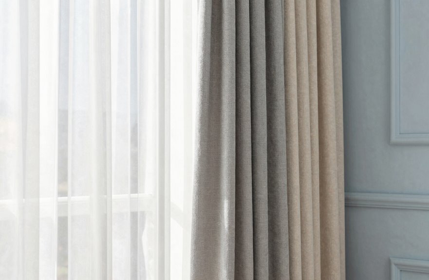
At dawn, I’m always struck by how my powder-blue bedroom glows when I throw open those crisp white curtains. The walls appear to breathe with the natural light. Light blue walls create an airy contrast with white curtains, making even small spaces feel like beach houses. Gray curtains add quiet sophistication without competing for attention, offering a calm aesthetic. Soft neutral curtains, like whispery taupe, wrap the room in warmth while maintaining visual harmony. Sheer white panels brighten spaces effectively by filtering sunlight into a golden haze. This blue wall and curtain combination creates a fresh, welcoming environment that complements various room sizes and design preferences.
Medium Blue Walls: Beige and Warm Gray for Balanced Contrast
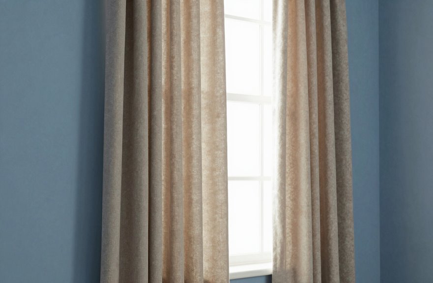
Medium blue walls—think royal, cobalt, slate—can feel intense without proper softening. Beige tones work first as a warm foundation that keeps spaces modern without stuffiness. Warm gray serves as a complementary option, adding contemporary edge that complements rather than conflicts with blue. These colors create visual harmony through intentional pairing.
When combining these elements, linen or cotton textures in solid neutrals work best, with subtle weaves as optional additions. This approach produces balanced contrast with an authentic, comfortable quality rather than an overly styled appearance.
Beige Tones Explained
Why does medium blue feel so tricky to balance? It’s too bold for stark white and too cool for harsh black. Staring at walls and wondering what won’t clash is a common challenge.
Beige tones solve this problem. They soften medium blue walls without stealing the show, adding warmth that creates an inviting atmosphere. Yellow-based beige curtains deliver that cozy, sunlit feeling; think sandy shores rather than institutional tan. Pair them with linen slub or woven textures, and your room gains visual breathing room.
The undertone game requires matching the right beige to your space:
| Beige Type | Best Paired With |
|---|---|
| Yellow-based beige | Golden hour lighting, brass accents |
| Taupe-based gray | Cooler blues, silver hardware |
| Linen slub texture | Casual, layered spaces |
| Woven textures | Bohemian, eclectic vibes |
Warm Gray Benefits
How do you keep medium blue from feeling like a pool you’re drowning in? Warm gray curtains work. Suddenly your blue walls breathe. The contrast balance feels intentional, not accidental.
Here’s my secret: warm gray curtains with beige undertones. They soften everything, creating this cozy atmosphere that welcomes you home. I learned the hard way; avoid cool grays at all costs. They turn your inviting space into a doctor’s office, and nobody wants that.
I hung Carmen Linen Stripe in light grey, and that subtle texture is exceptional. It hides coffee splatters, my superpower, while complementing the blue’s richness. The warmth harmonizes everything, making the room feel like it hugs you back. Your space will feel intentional and complete.
Balanced Contrast Tips
When you’re staring at medium blue walls that feel like they’re swallowing the room whole, beige and warm gray curtains are your rescue team. My cobalt bedroom looked like an aquarium until I discovered warm neutrals.
For balanced contrast, you’ll want muted tones, not stark white. My first attempt with white curtains felt like an ice hotel. Beige curtains in soft linen, or warm gray curtains in cotton, create that cozy bridge your blue walls need.
Taupe patterns add interest without demanding attention; subtle stripes work well. The soft textures against glossy paint create a polished look. These curtain colors don’t fight your blue walls; they complement them, making everyone who enters feel instantly at home.
Dark Blue Walls: Navy, Charcoal, and Deep Green Curtains

Where do I even start with dark blue walls? I used to find them intimidating until I discovered the magic of pairing them right.
Here’s what I’ve learned works:
- Navy curtains layered over dark blue walls create this cocoon-like depth you wouldn’t expect.
- Charcoal curtains give you those sleek neutral contrasts that let your blue walls stand out without stealing focus.
- Deep green curtains against dark blue deliver that luxurious palette feeling like a velvet jewelry box.
- Velvet curtains in any of these shades, plus some warm accents like brass rods, create instant drama.
I hung charcoal panels in my own bedroom last year and added amber lamps. The result felt like an actual design magazine bedroom. Your instincts will guide you toward the right choice.
Bold Accents: Mustard, Gold, and Blush for Personality
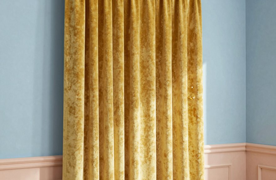
I love breaking out of that moody, layered look for something that actually makes me smile when I walk in the room. That’s where mustard curtains and gold accents completely transform my blue walls into something alive.
Mustard curtains and gold accents transform blue walls into something that actually makes me smile when I walk in.
My first attempt at bright mustard against royal blue was aggressive. Moderation matters. Now I gravitate toward patterned fabrics that weave mustard with softer threads, or I layer blush tones nearby to soften the contrast. The vibrant warmth envelops the room.
My secret weapon is warm hardware. Brass curtain rods pull everything together so the space feels intentional, not chaotic. Deep mustard against my navy bedroom wall creates enhanced contrast without competing with my existing pieces.
These bold choices aren’t for everyone, but they’re definitely for us.
Patterned vs. Solid: What Works Best With Blue
How do you choose between a statement pattern and something quietly solid when your walls are already doing so much strong work? I’ve stood in that exact spot, swatches in hand, completely frozen.
What I’ve learned about blue walls and finding your perfect match:
- Patterned curtains with soft neutrals and subtle blue accents create gorgeous color contrast without excessive visual competition.
- Solid curtains in neutral tones let your walls breathe while keeping things cohesive.
- Large-scale patterns work beautifully on dark blue walls, but keep those motifs simple and clean.
- Damask patterns can be stunning, but check your rug first. Clashing patterns will make your room feel chaotic.
Patterned curtains in busy spaces hide life’s little messes. Solid curtains in soft neutrals can simplify a bedroom’s visual landscape by reducing visual noise and creating a restful environment.
Final Tips: Testing Swatches and Avoiding Common Mistakes
Once you’ve wrestled with pattern versus solid, the real test begins: actually seeing fabric against your walls in natural light, not under fluorescent store lights. Order swatches first. A “perfect” sage can turn swampy green by Tuesday afternoon sun if you don’t test it properly.
Testing fabric samples at different times matters. Hold them up, step back, and watch how they breathe in various lighting conditions. Neutral curtains in white, off-white, or cool grays keep things light and airy without competing with your walls. For contrast, dark gray or navy against medium blue walls creates a strong visual effect.
Avoid patterns that demand attention. Small, busy prints compete with your walls rather than complement them. Choose solid colors or large-scale patterns instead. Color accuracy prevents returns, and free swatch programs let you feel texture, check sheen, and make decisions with full information about how the fabric will perform in your space.